
The Sentiment Ticker: Why We Should Track Morale Like a Stock Market
Plus: A free tool I built for you to steal and visualize your own organizational volatility.

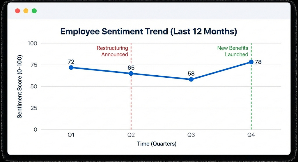
If you opened a finance app and saw a stock chart that was just a single, flat line moving slowly across the screen, you’d assume the data feed was broken. Markets don’t move in averages. They move in cycles. They have volatility, highs, lows, momentum, and occasional panic.
So why do we accept flat lines for employee sentiment?
Far too often, engagement and morale is visualized as a simple moving average line chart. It’s clean and familiar. It’s also quietly misleading. Infrequent surveys with these averages smooth over the jagged reality of human experience making everything looks stable, even when it isn’t.
Part of the reason this survived for so long is that we were never really sampling sentiment like a market. We’d run an annual engagement survey, aggregate it, and call it the truth. That’s like trying to trade a stock with last year’s closing price.
But the world shifted and it was shifting even before mainstream AI. Now we have two categories of signal that can actually capture movement.
-Pulse listening is active. It’s lightweight, frequent check-ins that trade depth for cadence.
-Passive listening is ambient. It’s behavioral and textual signals already created by work that can hint at load, friction, and mood if you use them carefully.
So, if you want a volatility chart, you need volatility-grade data. You can’t draw candlesticks from an annual survey any more than you can judge a company’s health from a single annual earnings call.
Two Teams. Same average. Completely Different Realities.
Scenario A: Everyone on the team rates their morale a “3.” The average is 3.
Scenario B: Half the team is burnt out (1) and half is thriving (5). The average is still 3.
In a standard moving average, these two teams look identical. To a human leader, Scenario B is a crisis warming up in the corner. The team isn’t “fine.” It’s splitting into two different experiences and one of them quietly becoming unsustainable.
The average can’t see distribution. It can’t see spread. It can’t see polarization. And those are often the most important things to see.
Pulse and passive listening are especially good at capturing exactly that. Pulse gives you repeated snapshots of how people are doing. Passive signals give you early tremors before people even label what they’re feeling as “morale.”
Put them together and you stop asking, “What’s the average engagement?” and start asking, “Are we stable, or are we breaking into factions?”
Enter the “Sentiment Ticker” aka “ The Candlestick”
I've been experimenting with borrowing a visualization from the financial world - the candlestick chart.
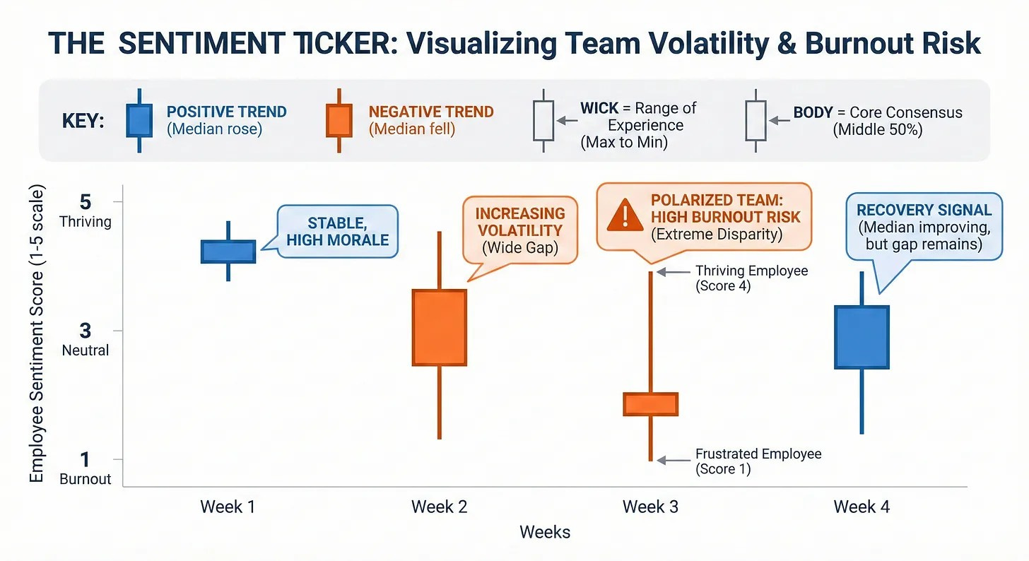
Traders use candlesticks because they show the full story of price movement in a specific time period. Not just where it ended up, but how chaotic the ride was to get there. I think we should use the same concept to show the full story of human experience in a specific week.
A sentiment candlestick doesn’t pretend the team is one number. It treats the team like what it is. A distribution of experiences moving over time.
Here’s how to read a Sentiment Ticker.
The Wick (the line): the range of experience.
The top of the wick is your happiest employee that week. The bottom is your most frustrated. A long wick means the team is polarized. People are having very different weeks inside the same org chart.
The Body (the box): the consensus zone.
The body captures the middle 50% of the team. In practical terms, that’s the “most people” story. If the body is tight, experiences are consistent. If it widens, alignment is breaking.
The Color (momentum): the direction of the median.
Green means the median sentiment is stable or higher than last week.
Red means the median sentiment dropped.
That’s the whole point: the color isn’t driven by a single outlier and it’s not fooled by a split team. It’s driven by the true center.
Where Does the Data Come From?
This is the part people get stuck on, because they assume you need a massive engagement survey engine to do any of this. You don’t.
You just need two things: a pulse feed and a context layer.
Pulse Listening: Your weekly “price feed”
Pulse is the cleanest input for candlesticks because it gives you a consistent, repeatable time series. You don’t need 40 questions. One to three well-designed questions asked bi-weekly or monthly will do more for visibility than an annual engagement census ever will.
These tend to work well over time:
“How sustainable did your workload feel this week?” (1–5)
“How confident do you feel about priorities and direction?” (1–5)
“How supported did you feel by your manager and team?” (1–5)
From there, the candlestick is just distribution math per team per week.
High wick = max score that week
Low wick = min score that week
Body = the middle 50% (25th to 75th percentile)
Median = the midpoint you compare week to week for momentum
You’re no longer “measuring vibes.” You’re measuring spread, skew, and direction. You’re measuring whether the team is moving together or drifting apart.
Passive Listening: The tremors behind the candle
Passive listening is where you can add early warning and explanation, but it has to be done with care. A lot of “passive listening” programs earn their bad reputation honestly because they slide into surveillance. Don't be big brother.
If you do it well, it isn’t “reading people’s messages.” It’s aggregating non-identifying signals that indicate friction and load, the same way a finance team watches leading indicators rather than individual bank transactions.
The safest passive signals don’t require reading any text at all.
After-hours meeting load (team-level trends)
Meeting fragmentation and context switching
Calendar utilization patterns across a group
Ticket or case volume per capita
On-call pages, incident volume, escalation rates
Work churn, like reopen rates and reassignments
Those signals don’t claim to be sentiment. They’re leading indicators of the conditions that typically produce sentiment shifts.
If you already collect open-ended pulse comments, employee forum posts, or structured feedback like “what slowed you down this week,” you can also extract team-level themes from text. The goal isn’t to score individuals. It’s to detect changes in the language of the team, like more “blocked,” “unclear,” and “exhausted,” less “shipping,” “momentum,” and “confident.”
The non-negotiable rule is that this never turns into a dashboard where a leader can reverse-engineer a person. This is health monitoring for the system, not attribution for the individual.
Why This is Better: The “Engineering Crash”
Let’s look at a hypothetical scenario I simulated. Below is a chart for an Engineering team over 20 weeks.
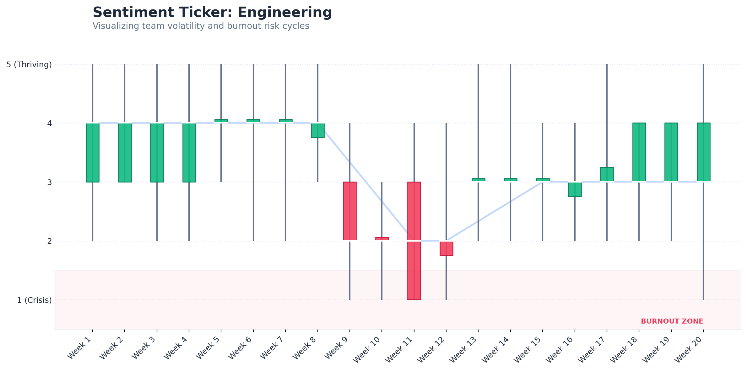
Now look at Week 9.
On a traditional line chart, the average might only dip slightly. It would look like a mild blip. Something you’d tell yourself is normal variation.
But the candlestick tells a concerning story.
The color flips red, meaning momentum broke at the median.
The wick elongates dramatically, meaning the range of experience exploded.
And the low drops into the burnout zone those 1.0 to 1.5 scores that don’t show up in an average until it’s too late.
This is the difference between a “gentle slope” and a crash.
A line chart encourages the most dangerous kind of leadership response, which is casual delay. You tell yourself it’s fine. You wait for next month’s survey. You keep the same meeting structure and staffing plan and hope it settles down.
A sentiment candlestick throws a different alert. Pay attention to the people falling off the bottom edge.
The Trust Clause
This only works if employees trust it. If pulse and passive listening feel like monitoring, people will either stop answering honestly or stop participating entirely, and you’ll be left with a very expensive illusion.
The rules have to be boring and explicit:
Report at team level only, with minimum group sizes
Never use it for performance management or individual targeting
Be transparent about what signals exist and what they’re used for
Offer opt-outs where feasible, especially for text-based signals
Treat it like a governed product, with review and guardrails
Leaders don’t need more data. They need better instruments that don’t reward denial.
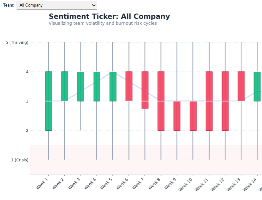
🛠️ The Utility: A Tool For You to Copy and Use
I didn’t want to just write about this concept; I wanted you to be able to use it. If your company uses Gmail/Google, you can do this in 10 minutes.
Most HR or BI platforms won’t let you build this easily. So, I built a lightweight Python Tool that runs right in your browser. It takes your raw survey data and automatically generates these financial-style charts.
It is free, secure (the data stays in your Google Drive), and requires zero coding skills.
Step 1: Get the Data Template
To make this work, your data needs to be in a simple format: Employee_ID, Department, Week, Score.
Click File > Make a copy.
Paste in your own survey data (or keep the dummy data to test it out).
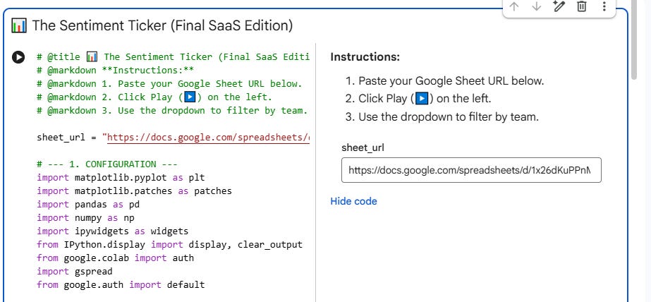
Step 2: Open the Tool
[Click here to open the Sentiment Ticker Generator] in Google Colab
Important: Click File > Save a copy in Drive.
Do not skip this step! Why? This saves a private version of the code to your personal Google Drive so you can save your settings and keep your data private.
Step 3: Visualize
Copy the URL of the Google Sheet you created in Step 1.

Paste it into the sheet_url box in the tool.
Click the Play Button (▶️) on the left side of the code block underneath “The Sentiment Ticker” title.
Google will ask for permission to read your Drive files. Click Allow.
Note: This script runs entirely within your personal Google account. No data is sent to me or anyone else.
Scroll down to see your interactive dashboard. You can now filter by department and spot the burnout cycles before they become attrition statistics.

Why “Open Source” HR Tech?
We often wait for vendors to build the features we need. But tools like Python and Google Colab allow us to build and vibecode our own “micro-apps” to solve specific problems.
If you use this with your team, I’d love to hear what patterns you spot. Did you catch a “Crash” before it happened?
Disclaimer: This tool is for educational and visualization purposes only.
IQR put to good use in a time series fashion. Nice